Why It Matters: Graphing
Why explain the use of graphs and create graphs using linear equations?
Much as the road sign at the right can help you quickly understand a "falling rocks" hazard ahead, graphs are a useful way of conveying information visually. Graphs of linear equations are especially effective for representing relationships between things that change at a constant rate, and they often do a better job than words or mathematical equations alone.
Suppose your manager has asked you to create and present a financial report at the next company meeting. She wants to know how the amount of revenue your team brought to the company changed during the last year. Your job is to get the information and choose the best method for communicating it.
You start with a table and add the values:
| Month | Revenue |
|---|---|
| 0 | 1000 |
| 1 | 1250 |
| 3 | 1750 |
| 5 | 2250 |
| 7 | 2750 |
| 9 | 3250 |
| 11 | 3750 |
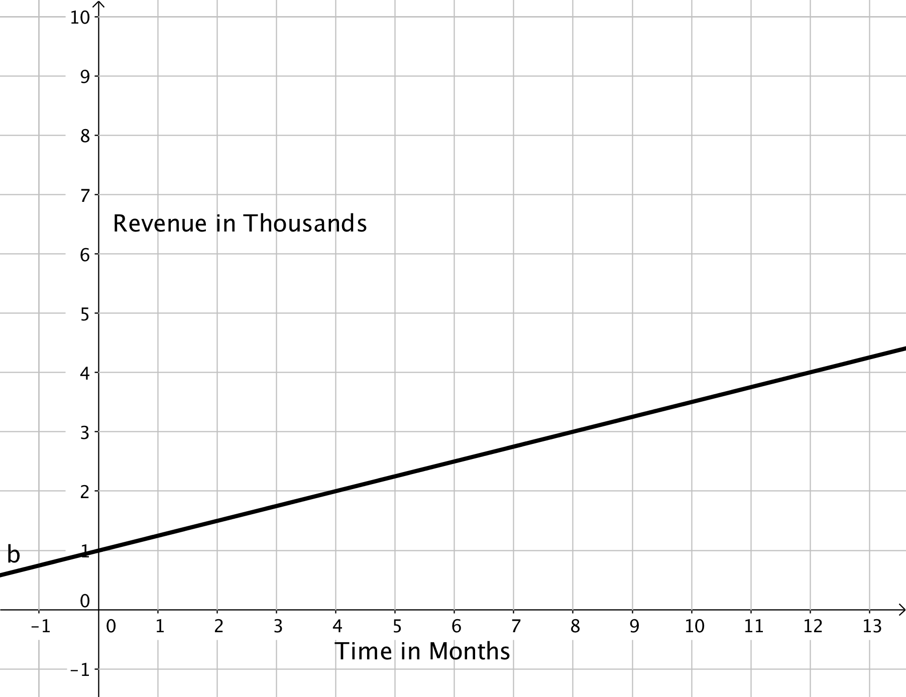
Our team started the year with $1000 per month in revenue. For each additional month in the year 2015, our team produced an increase in $250 of revenue.Next, you try expressing the information as a linear equation: [latex]y=250x+1000[/latex] Again, both are very accurate, but neither reading two sentences out loud nor putting an equation on a poster board will go over very well with your manager or team members. You haven't given them a way to picture the information. So, you try graphing the equation, which gives you the following:
 Graph showing the linear relationship between time and the change in revenue.